By Neha Chandelier, co-founder of Listadum · Last updated August 12, 2026
The winning tumbler seemed obvious to me: put a name on it. Every bestseller I scrolled past was a cup with “Emily” in flowing script or a monogram laser-etched into powder coat, so I assumed that was the whole game. Personalize it, charge for the personalization, done.
Then I actually looked, and the tumbler shelf turned out to be its own strange country. Nearly half of it is names: a first name in script, a monogram, a bridal-party set in six matching colors, a photo printed around the side. It looks like that is what sells, because there is so much of it.
But when I ranked every listing by whether real people were actually saving it, that whole personalized half sank to the bottom. And a thing I did not expect rose to the top: not the engraved name, but the full-color printed wrap — a design that goes all the way around the cup.
If you have ever added a name-tumbler to your shop because “that is what everyone buys” and then watched it just sit there under a wall of identical cups, you were not doing it wrong. You were selling into the most crowded, most pay-to-play, most misunderstood corner of Etsy drinkware. So I stopped guessing and pulled the data instead.
I captured the top listings for four of the biggest tumbler searches on Etsy, deduplicated them down to 678 unique designs, and ranked every one by a single number that shows whether people actually want a design. Not Etsy’s default order. Real demand. Then I hand-coded all 678 by theme, production style, and mockup so I could see the pattern underneath.
This is the long version: the full ranking, the design types that win with a ready-to-use prompt to make each one, the traps, the benchmark to grade your own work, and the one production twist that separates tumblers from every other product. Grab a coffee — ideally in one of these.
The one number that tells you if a design sells
A view count by itself is noise — it climbs with ad spend and with age. Favorites mean more, but only next to how many people actually saw the listing, and Etsy shows neither number on the search page. The free Listadum browser extension puts views and favorites on every card as you browse, so you can compare them yourself.
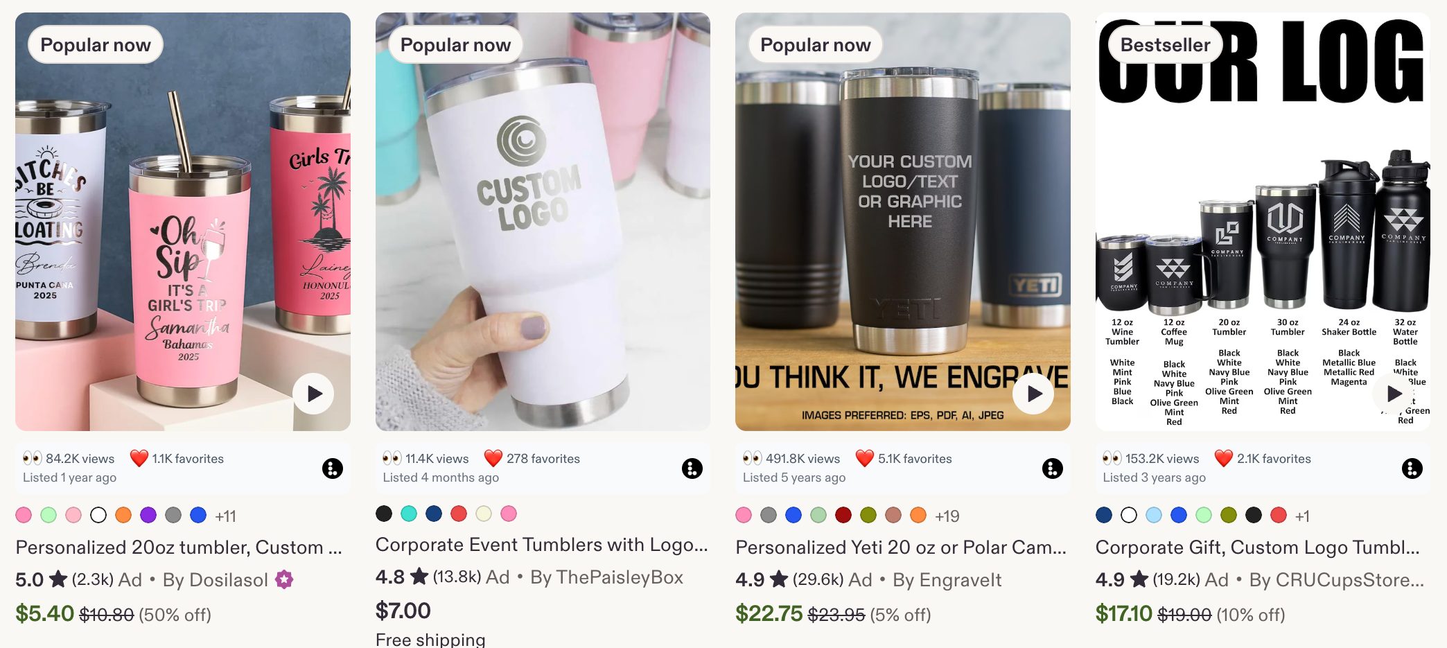
What the Listadum extension adds to a normal Etsy search — the views and favorites count on every card. Those two numbers are what this whole method runs on.
Divide one by the other and you get something useful:
Favorite ratio = favorites / views.
Inside Listadum, we call this your favorite ratio, and it is the number I trust most when I judge a design.
Of the people who saw this design, what share liked it enough to keep it. That single ratio strips out the noise. A brand-new tumbler from a tiny shop and a two-year-old listing from a shop with 50,000 sales can finally be compared fairly, because the favorite ratio cancels out ad spend, age, and shop size.
It measures the design’s pulling power, and nothing else. And pulling power is the part you actually control when you sit down to make a new cup.
When I re-ranked all 678 listings by favorite ratio, the order scrambled hard. Designs Etsy had buried out-pulled designs sitting in the top row. Etsy’s default sort tells you what Etsy is promoting. The favorite ratio tells you what buyers love. Those are not the same list.
One thing to know going in: tumblers are a harder market than apparel. The median favorite ratio here is 2.1%, versus 6.1% on tees. 65% of ranked listings run ads, versus one in five on tees. The median price sits around $18. It is a crowded, low-ratio, heavily advertised, mid-price gift market — which is exactly why picking the right design, instead of the default one, matters more here than almost anywhere.
A designed wrap wins — the engraved name loses
Here is the headline finding, and it comes in two parts.
First, the part that carries over from apparel: buyers save designed content, not decoration and not their own data. A colorful, characterful design — a fandom hook, a whimsical animal, a bold pattern, a floral with a point of view — pulls more saves than a name in script almost every time.
Second, the part that is unique to tumblers: the full-color wrap is the medium. Full-color sublimation wraps — a design printed all the way around the cup — are only a third of the shelf (33%) but nearly 60% of the winners.
The two crowded personalized looks lose badly by comparison: laser-engraved names are 41% of listings but under-index at 0.57x, and plain printed text under-indexes worst of all at 0.24x. On a blank steel cup, buyers reward the piece that looks designed and alive, not the one with their initials etched into it.
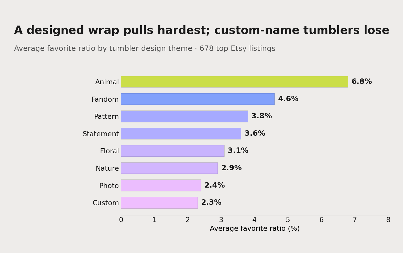
The plain-English version: on a tumbler, the name is not the product — the design is. Say something specific to a specific person, or give them a world to carry around, and then wrap it in full color rather than etching a name into the metal. A whimsical animal wrap, a fandom-energy design, a bold repeating pattern will out-save a monogram or a printed photo every single time.
That is the big picture. Now let me show you the whole board, not just the top of it.
The full ranking: winners, runners-up, and what to skip
Every theme is not a simple win or lose. There are tiers, and the runners-up matter as much as the champions, because they are less crowded and still pull well. Here is where each design theme landed, by average favorite ratio across all 678 listings. The overall median is 2.1%.
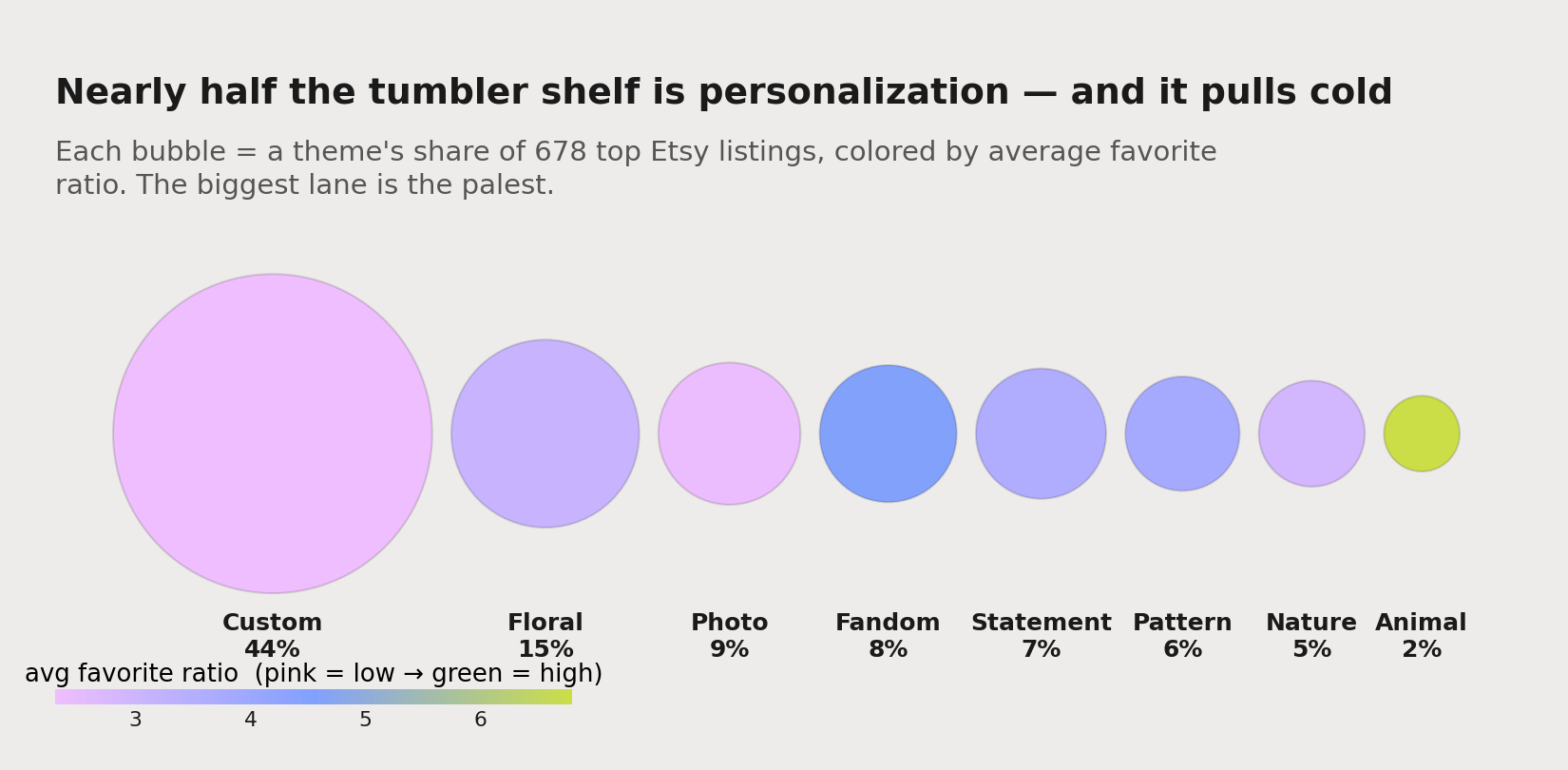
But shelf space and pulling power are two different things — plot each theme by how crowded it is against how hard it pulls, and the open lanes jump right out.
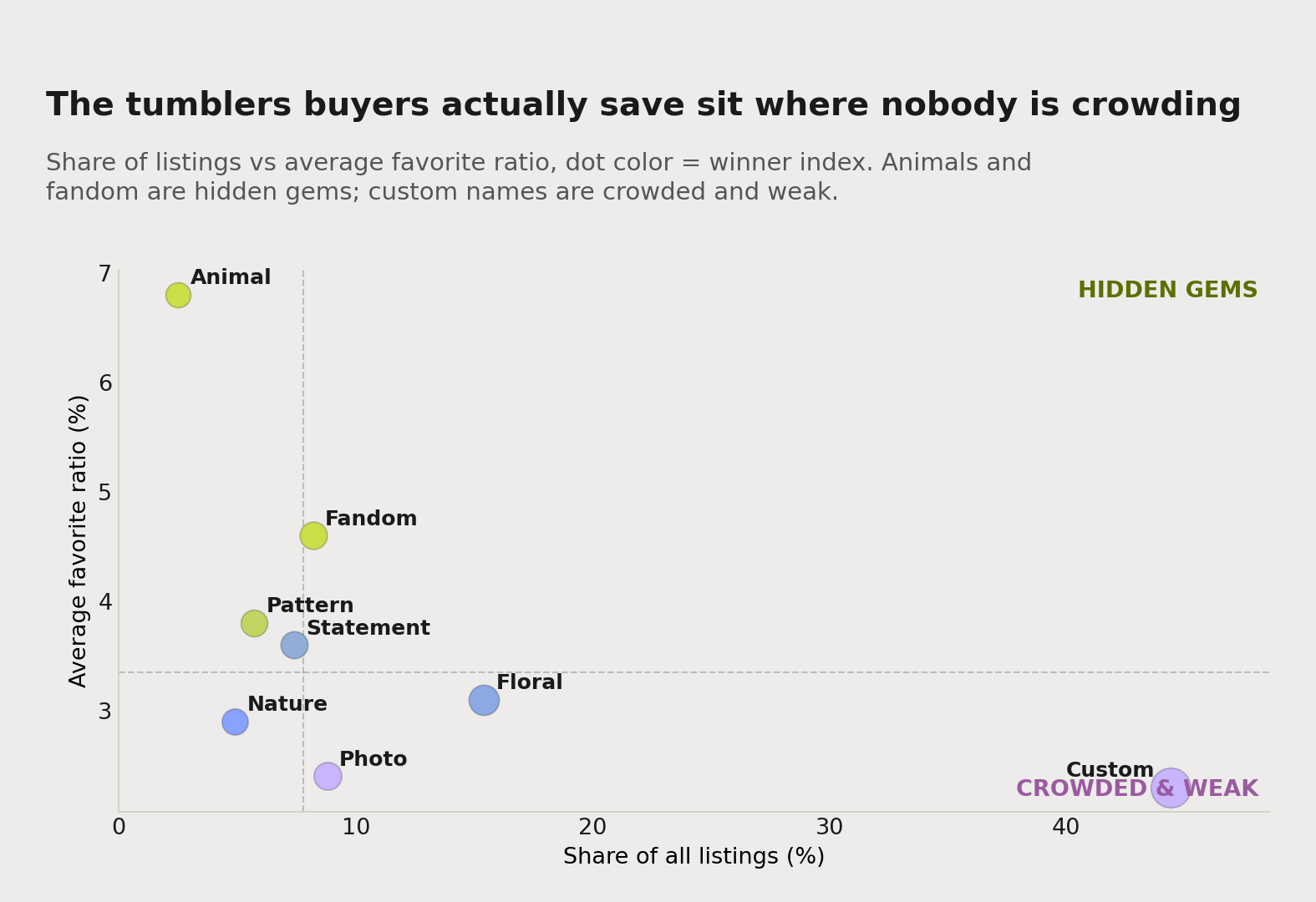
The top pullers (well above the median). Animals (6.8% average) are the single highest-pulling theme in the study, from a tiny sliver of the shelf — just 2.5% of listings but 11% of winners. Fandom and nostalgia (4.6%) is the biggest engine of the winners’ circle: 8% of listings and a quarter of every winner. Both punch far above their weight because demand is high and supply is thin.
The strong core (right around the top third). All-over patterns (3.8%) and statements and quotes (3.6%). Patterns are a small slice that produces more than twice its share of winners; statements are the reliable text lane.
The volume play with a modest average: floral (3.1%). Floral sits only a little above the median on average, but because it is 15% of all listings — the second-biggest block on the shelf — it still produces almost one in five winners. Volume plus a solid-enough average equals a lot of trophies. The winning florals are full-color wraps with a real point of view, not a single sprig.
The middle of the pack (around the median). Nature and celestial (2.9%). Fine if you have a strong, specific angle, forgettable if you do not.
The weak tiers (below the median). Photo tumblers (2.4%) and — nearly half the entire shelf — custom and personalized names (2.3%). Custom is by a mile the most crowded category on the whole board, which is the worst possible combination: enormous supply, weak pull. More on that trap below.
Two things jump out when you read it this way. First, the gap between the top puller and the custom floor is roughly 3x. Second, the winners are not exotic. They are designed, colorful wraps — an animal, a fandom hook, a pattern — carrying a bit of personality.
Here is how much each theme over- or under-delivers relative to the shelf space it takes up — its share of winners divided by its share of listings: animals punch 4.3x their weight, fandom 3.0x, patterns 2.2x, statements 1.3x, floral 1.2x. Custom names deliver 0.35x and photo tumblers 0.35x. That ratio is the real map of where the open lanes are.
The winning design types (with a prompt to make each)
This is the part I wish someone had handed me three years ago. For each winning type: what the data says, why it works, and a Gemini prompt you can use to generate your own original version — written for the tumbler medium, which almost always means a full-color sublimation wrap.
Two rules before you generate anything, because they decide whether your shop survives. Keep it original, since Etsy requires print-on-demand art to be your own. And never prompt for a real brand, character, logo, team, or lyric. Every prompt below is written to stay clear of that. Swap the CAPS placeholder for your niche so the output is yours, not a generic AI design a hundred other sellers can also make.
1. Fandom and nostalgia energy, made original (biggest share of winners, over-indexes 3.0x)
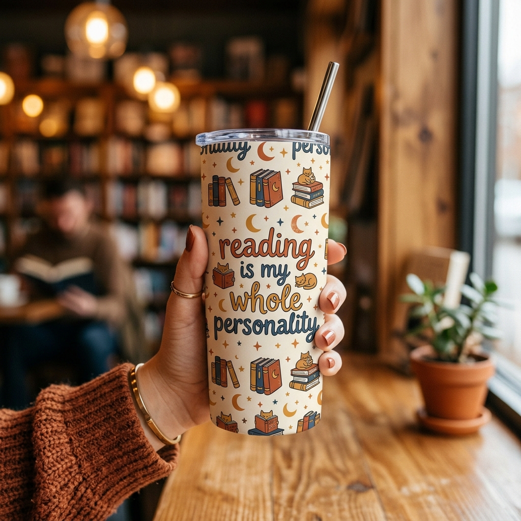
The single biggest engine of the winners’ circle — a quarter of every top listing — and the most legally dangerous if you do it wrong. You cannot use a real show, band, or character. You can own the identity of a hobby, an era, or a community: readers, gardeners, true-crime fans, 90s kids, coffee people. The move is a full-wrap design that only real fans of that thing fully get, in colors and type that feel like their world.
A full-wrap sublimation design panel for an insulated tumbler that captures superfan energy for A HOBBY OR INTEREST, not a brand (for example reading, gardening, true crime, camping, 90s nostalgia). A short in-group phrase “YOUR INSIDER LINE HERE” that only fans of that thing fully get, set in confident retro type, surrounded by simple related icons repeating across the whole wrap. Warm cohesive palette, high contrast, seamless left-to-right so the pattern meets edge to edge, transparent background, isolated artwork, thumbnail-readable. No real franchise, character, logo, or trademark. Design panel only, no tumbler, no mockup.
2. Whimsical animal wrap (the highest pull at 6.8%, over-indexes 4.3x)
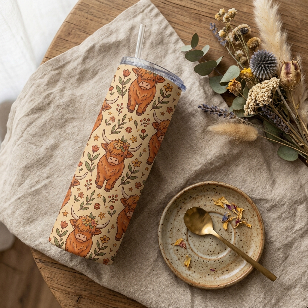
The highest-pulling theme in the study and the biggest over-performer by volume, from almost no competition. A cute, slightly odd little creature — a chubby cat, a golden retriever, a frog, a highland cow — as a full-color wrap, with or without a short warm caption. Endlessly giftable, and buyers save it on sight.
A full-wrap sublimation design for an insulated tumbler featuring A SINGLE CUTE ANIMAL (a chubby cat, a golden retriever, a frog, a highland cow) drawn in a warm, slightly retro storybook style, repeated or scattered across the whole wrap with a small optional caption “YOUR LINE HERE”. Limited earthy palette, clean outlines, seamless edge-to-edge composition, high contrast, transparent background, isolated artwork, reads clearly at thumbnail size. Original artwork only, no brand, no tumbler, no mockup.
3. All-over pattern wrap (small, open, over-indexes 2.2x)
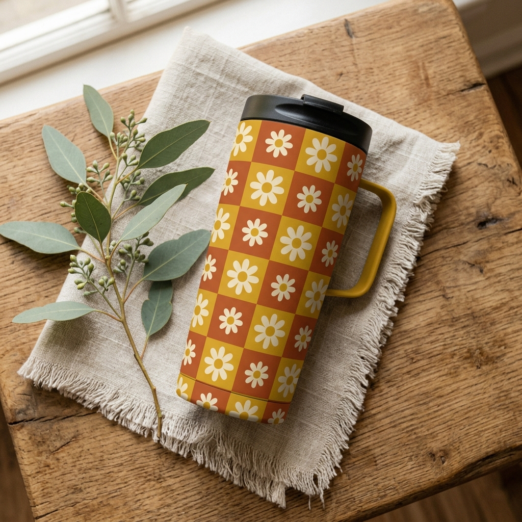
The tumbler is the perfect canvas for an all-over pattern, because the wrap goes all the way around and the repeat never breaks. A bold, cohesive pattern — checkerboard, groovy 70s wavy stripes, folk florals, retro mushrooms — punches more than twice its weight and there are relatively few done well.
A seamless all-over pattern design for a full-wrap insulated tumbler built around A SINGLE MOTIF (retro daisies, wavy 70s stripes, checkerboard, little mushrooms, folk hearts). Bold and cohesive, tiling perfectly left to right and top to bottom so the wrap has no visible seam, in a warm confident three-to-four color palette. Flat vector look, transparent background, isolated artwork, crisp at thumbnail size. Original artwork only, no brand or trademark, design panel only, no tumbler, no mockup.
4. Statement and quote wrap (the reliable text lane, over-indexes 1.3x)
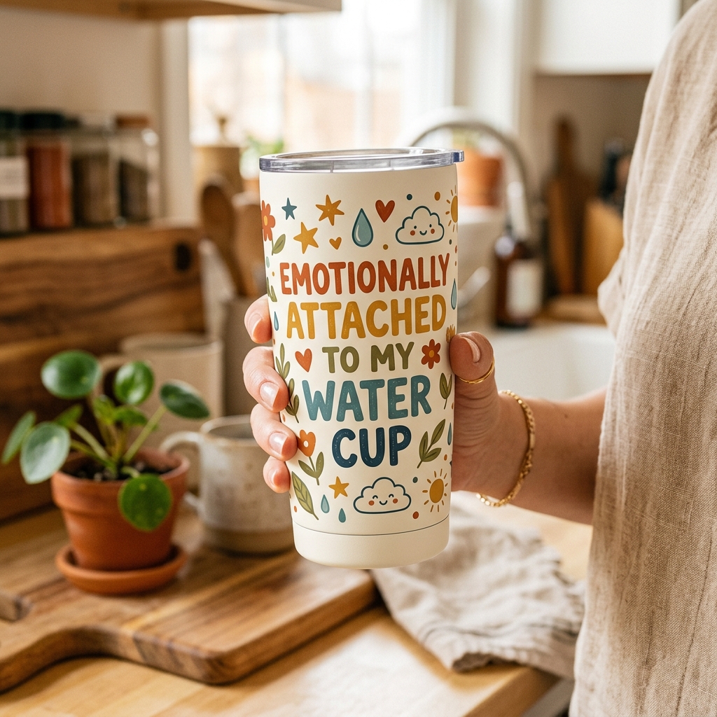
The dependable text lane. A short, punchy line that says something a specific person wants to carry around — but wrapped big and bold in full color, not etched small and gray. The winners are readable in under a second and oddly specific (“emotionally attached to my water cup” beats “stay hydrated”).
A bold full-wrap sublimation design for an insulated tumbler built around the phrase “YOUR SHORT IDENTITY LINE HERE” (a proud, funny, or slightly sarcastic line for a SPECIFIC PERSON such as a nurse, a plant parent, or a chronically thirsty person). Set in confident retro type, stacked and repeated so it reads all the way around, one or two accent colors plus simple supporting doodles. Seamless edge-to-edge, high contrast, transparent background, isolated artwork, thumbnail-readable. Just the design panel, no tumbler, no mockup.
5. Floral wrap with a point of view (the volume winner, over-indexes 1.2x)
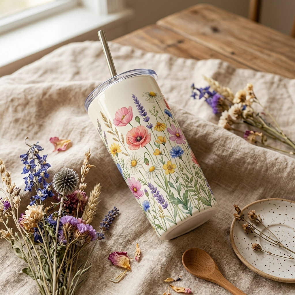
Floral is 15% of the shelf and produces almost one in five winners — but only when it is a designed, full-color wrap with a hook, not a lonely sprig. Rich botanical wraps, wildflower meadows that circle the whole cup, a floral behind a line of text. The flowers are the decoration; the composition and color are what earn the save.
A lush full-wrap floral design for an insulated tumbler: A FLOWER OR BOTANICAL THEME (wildflower meadow, pressed-flower collage, bold retro blooms) arranged so the flowers wrap continuously around the whole cup with no visible seam, optionally framing a short phrase “YOUR LINE HERE”. Warm cohesive palette, painterly or flat-vector look, high contrast, transparent background, isolated artwork, reads well at thumbnail size. Original artwork only, no brand, design panel only, no tumbler, no mockup.
6. Nature and celestial wrap (open, giftable, right at the top of the middle)
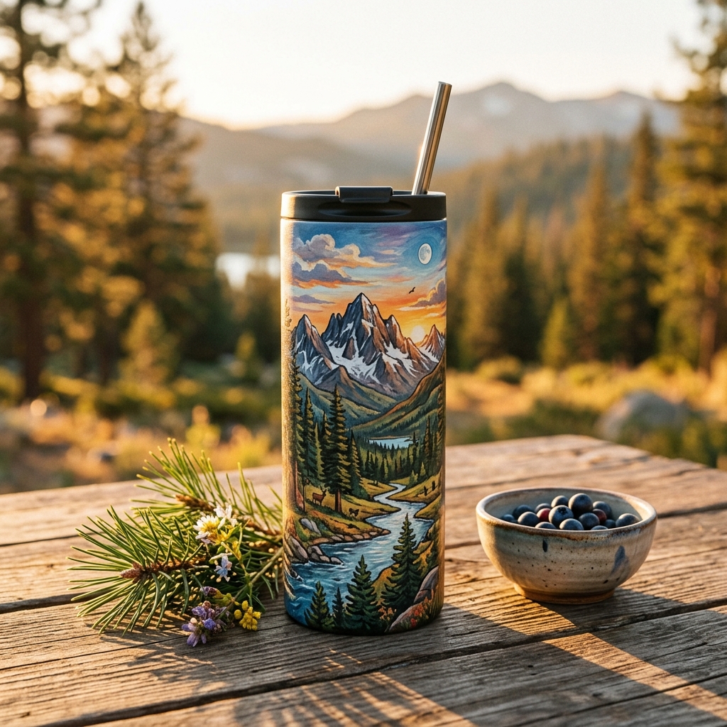
An open, giftable lane that suits the wrap format beautifully: mountains and pines that circle the cup, a desert landscape, a night sky of suns, moons, and stars. It reads calm and premium, and there is room to own a specific mood.
A cozy full-wrap design for an insulated tumbler centered on NATURE OR A CELESTIAL THEME (mountains and pines, a desert at dusk, a starry night sky, ocean waves) composed so the scene wraps continuously around the whole cup with no seam, with an optional short phrase “YOUR LINE HERE” (a made-up trail or place name, or a warm line). Warm earthy or deep celestial palette, soft texture, high contrast, transparent background, isolated artwork, readable at small size. Original artwork only, no real park, place, or brand names, no tumbler, no mockup.
One bonus lane: the glass can (over-indexes 2.8x, tiny)
Not a theme but a format, and worth flagging because it over-indexes hard from a small base: the glass-can cup with a bamboo lid, usually shown held in a bright lifestyle scene. If a full-color wrap on a glass can fits your niche, it is an open, high-pulling lane. Same two rules apply.
After you generate any of these, shrink it to about 200 pixels wide and see if you can still read it. If you cannot, simplify: fewer elements, higher contrast, bolder motif. That thumbnail test is the difference between a design that pulls and one buyers scroll past.
💡 Pro tip — make it a wrap. Before you finalize any design, ask whether it reads as full color printed all the way around the cup, not a name etched into bare metal. That one production choice is what moves a tumbler from the crowded half of the shelf into the third of listings that are wraps and take nearly 60% of the winners.
The two traps that look busy but rarely sell
Two kinds of design flood these searches. Because there are so many of them, they look like proof of demand. The favorite ratio says otherwise.
Custom and personalized name tumblers. These are 44% of every listing I studied — nearly half the entire shelf — and only 0.35x their share of winners, averaging a 2.3% favorite ratio, below the overall median. The problem is baked in: when the design is the buyer’s own name, monogram, or bridal-party set, you are not competing on creativity, you are competing on price, reviews, and ad spend. That is a fight a new shop rarely wins — and on tumblers, where 65% of listings run ads, it is the most expensive fight on the board. This is the “name in script / your initials here” red ocean, and it is the biggest block on the shelf.
Photo tumblers. Printing a customer’s photo around the cup feels premium, but it under-indexes just as hard as names (0.35x, 2.4% average). A photo is the buyer’s data, not your design — so once again you are competing on service and price, not on a design anyone can fall in love with at a glance. Note the exception: a designed collage or a photo woven into original artwork behaves like a design, not a photo dump, and does fine. The photo is the ingredient; the design is the hook.
None of this means these designs are bad. They are crowded. Supply is enormous and it is hard to stand out, so the next new listing gets ignored. Enter these lanes only with a genuinely different angle, and spend most of your energy in the under-supplied, high-pull lanes instead.
💡 Pro tip — decorate, don’t personalize. The instant your “design” is the buyer’s own name, monogram, or photo, you stop competing on creativity and start competing on price, reviews, and ad spend — the most expensive fight on Etsy’s most ad-heavy shelf. Sell the wrap a stranger would want on their own cup, and make personalization a small add-on option, not the product.
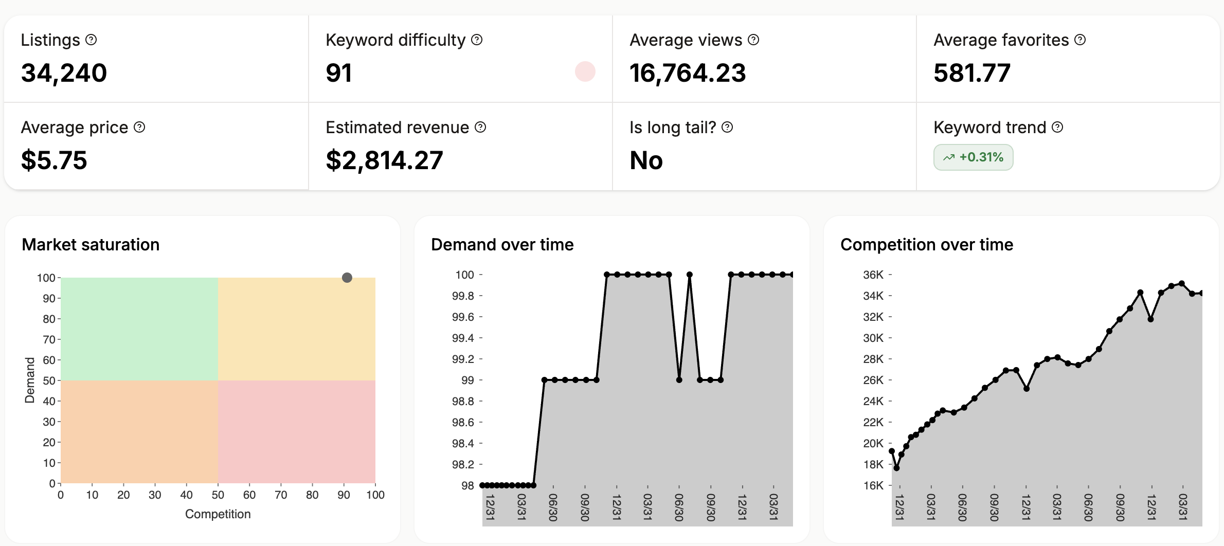
Want to see how crowded a design angle is before you commit to it? That is what the free Keyword Explorer shows you: demand against competition for any phrase, so you can aim at a pocket that is not already a red ocean.
Your yardstick: is your design a winner?
Numbers are only useful if you can hold your own work up against them. So here is the scale for a tumbler that already ranks on Etsy.
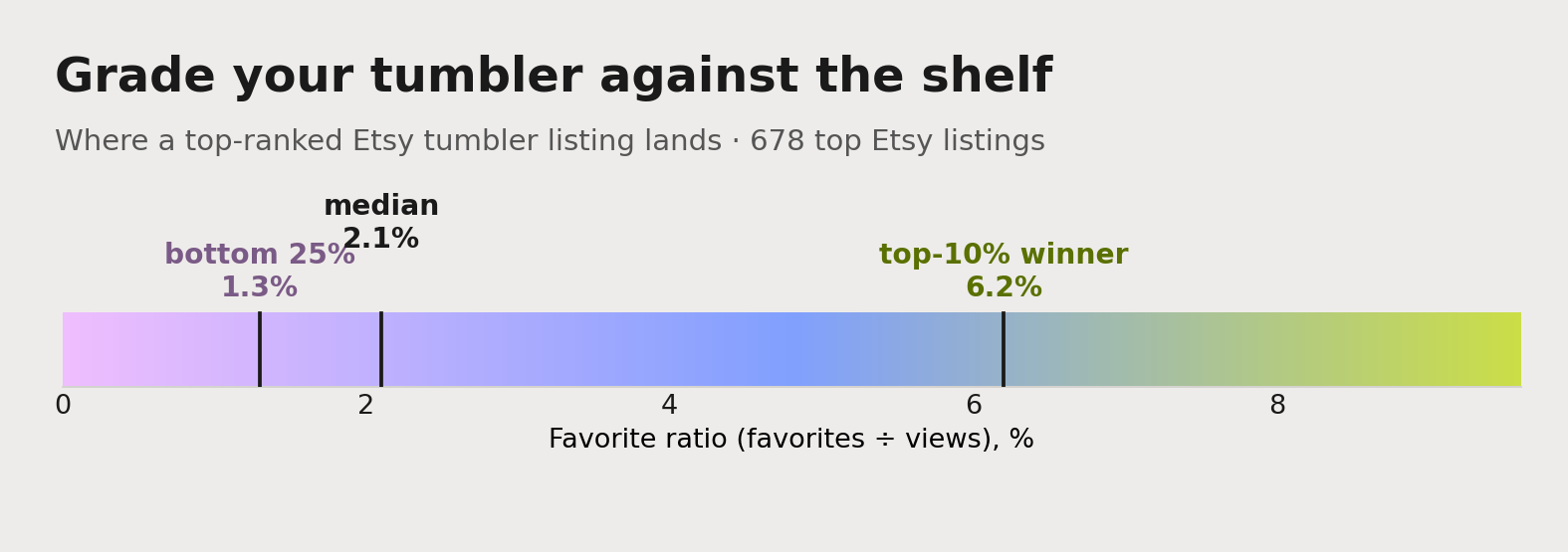
- Under 1.3%: the bottom quarter. People are seeing it and scrolling past. Rethink the design.
- Around 2.1%: dead average. Fine, not a winner.
- 4% and up: top third. A strong design.
- 6.2% and up: the top 10%. A genuine winner.
If you sell on Etsy, you can run this check on your own listings tonight. Open a listing’s stats, divide favorites by views, and see where it lands. A design sitting under 2.1% is telling you something, and it is usually the design, not the traffic. The whole tumbler market runs cooler than apparel — a winner here is 6.2%, versus 13.5% on tees — so grade yourself against the tumbler scale, not the t-shirt one.
💡 Pro tip — grade a cup tonight. Open one of your live tumblers, divide its favorites by its views, and drop the number on the scale above. Under 2.1% and buyers are scrolling past — and on a tumbler that is almost always the design, not the traffic.
Two rules a design has to survive first
Before a design can sell, it has to stay up. Two Etsy rules quietly end more POD shops than any trend miss.
It has to be your own. Etsy’s Creativity Standards require that items made with production tools — which is all print-on-demand, sublimation, and engraving — are based on your own original design. Buying a trending wrap file or a stock engraving template and dropping it on a blank cup unchanged fails that test, and it is a common reason listings get deactivated. Our guide to Etsy’s rules for print-on-demand sellers walks through what “original” actually means in practice.
It cannot borrow someone else’s brand. Copying a hot design or using a protected phrase, logo, or character is the fastest route to a trademark strike and a shop at risk. The safe move is your own take on a theme, not someone else’s asset. If copycats are a worry the other direction too, there is a hidden setting that helps protect your shop from copycats.
Neither rule blocks you from selling a “coffee person” wrap or a cute-cat cup. Plenty of shops do. They block you from selling the exact one someone else already made. Original beats borrowed, and it is also the only version that lasts.
The mockup finding: style it, and stop agonizing
Now the part that will save you hours of second-guessing.
Sellers agonize over the mockup. Held in hand or propped flat with props? Which one converts? I checked across the whole set.
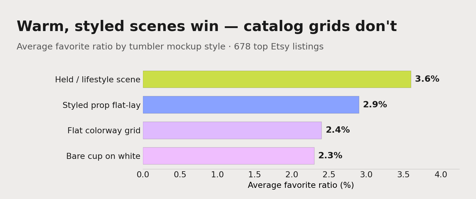
The dominant style — the styled prop flat-lay — averages 2.9%, and a cup held in hand or shown in a warm lifestyle scene averages 3.6%. Those are the two big styles, and the choice between them does not decide the favorite ratio. The design does.
But there is a real signal here, and it is about styling, not angle. The listings that lose are the ones shot as a flat colorway grid (the same cup lined up in twelve colors — the personalized-name default, 2.4%) or a bare cup on plain white (2.3%). Warm, propped, in-context scenes pull; catalog grids do not.
So the guidance is not “mockups do not matter.” It is: any warm, styled, in-context shot works, so stop agonizing over held versus flat-lay and pour that energy into a real scene and the design itself.
💡 Pro tip — show the seam. On a full-color wrap, buyers want to see how the design meets at the back and how it sits in the hand. Lead with one warm, styled hero for the thumbnail, then spend your other image slots showing the wrap all the way around — it does the buyer’s imagining for them.
A few things that still move mockups, none of which is the held-versus-flat-lay question:
- Do not ship the default supplier or Printify stock mockup. Everyone uses them, so your listing blends into a wall of identical cups. A realistic smart-object template or a bulk-mockup tool is worth the small effort. Here is what we learned about better listing images with mockups.
- Show the wrap all the way around. On a full-color design, the buyer wants to see how it meets at the back seam and how it looks in hand. Use most of your ten image slots, in an order: a styled hero for the thumbnail, then a held-in-hand shot, the full wrap flat, a scale or size reference, color options, a “what you get” graphic, then mood shots. The full sequence is in our guide to listing image types that drive sales.
- Match the exact blank. If you print on a 20oz stainless tumbler, mock it up on that exact cup, not a 40oz handle mug. Etsy requires the thumbnail to represent the real product, and mismatches drive returns and unhappy reviews.
- Add a simple video. A ten-second slow spin of the cup, or a slideshow of three or four mockups, gets impression priority and shows the wrap the way a flat image cannot.
- Disclose it. When an image is a mockup or AI-assisted, say so, both for Etsy’s standards and for buyer trust. Here is how and why to disclose mockups and AI images.
Free download: the Etsy SEO Checklist
A winning design still has to be found. This one-page checklist walks the titles, tags, and attributes that get a tumbler ranking, so the design you just made actually gets seen.
Grab the free Etsy SEO Checklist →
New shops break in — but it is tight
If all of this feels like the top of Etsy is locked up by big shops with ad budgets, the data says: harder than apparel, but not closed.
I flagged a listing as “rising” when it was new, pulling a high favorite ratio, from a small or mid-size shop. Those rising listings were only about 3% of the whole top set — far fewer than the 16% we saw on tees. Tumblers are more pay-to-play, and it shows. But the shops that do break in break in hard.
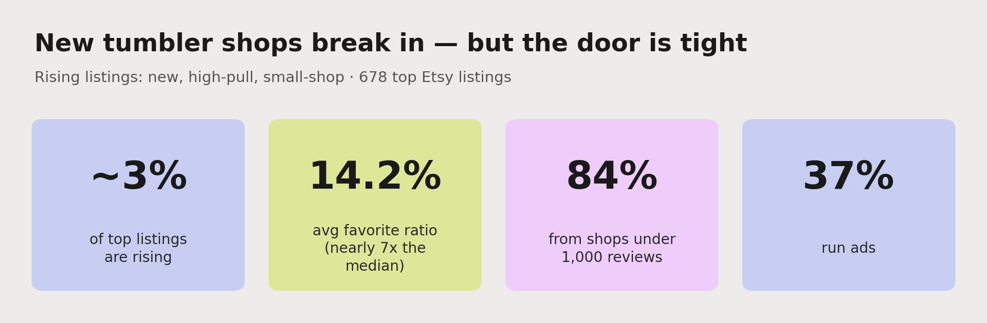
The rising listings averaged a 14.2% favorite ratio, nearly seven times the overall median and far past the winner line. 84% came from shops with fewer than 1,000 reviews. And 37% of them run ads — a reminder that on tumblers, a great design plus a small ad budget is often how a new shop actually gets seen. A third of the top set overall is under three months old, so fresh work is surfacing constantly.
And the rising designs win with the exact same playbook: a whimsical animal, a fandom hook, a bold pattern, a statement — as a full-color wrap. Not a plain engraved name, not “your photo here.” A fresh, specific, well-made wrap from a small shop is breaking into these searches every week. It is just a tighter door than on apparel, so the design has to be genuinely good and you should expect to put a little ad spend behind it.
That could be your shop. The design is the lever, and it is a lever you fully control.
Every tumbler niche plays differently
“Tumbler” is not one market — it’s four. The same design that wins under the generic tumbler search can sink under custom tumbler, because each search term pulls a different buyer and a different mix of designs. Here is how the four terms in this study compare, ranked by median favorite ratio.
| Search term | Listings | Median favorite ratio | Winner line (top 10%) | What dominates | Rising | Ads |
|---|---|---|---|---|---|---|
| 40oz tumbler | 289 | 2.3% | 7.2% | Fandom & nostalgia wraps 30%, animals 20%, florals 20%, statements | 2% | 61% |
| tumbler | 292 | 2.1% | 6.3% | Fandom & bookish wraps 35%, statements 20%, florals 20% | 0% | 63% |
| personalized tumbler | 280 | 2.0% | 3.5% | Custom names & birth-flower florals 65%, photos 20% | 0% | 77% |
| custom tumbler | 283 | 1.9% | 3.5% | Custom names & monograms 70%, photos 20% | 0% | 75% |
The split mirrors the whole study. The two terms where personalization dominates the shelf — custom tumbler (70% names and monograms) and personalized tumbler (65% names and floral names) — are the hardest, lowest-pulling, most ad-heavy lanes.
Their winner line is just 3.5% and roughly three in four listings run ads, so even the “best” designs there are barely pulling and you are paying to be seen.
The open, higher-converting terms are the generic tumbler and 40oz tumbler, where the winners are designed full-color wraps: fandom and nostalgia hooks, whimsical animals, bookish designs, bold florals. If you are starting out, chase the generic tumbler and 40oz searches with a designed wrap, not custom tumbler with a name generator.
Where to start this week
If you came in feeling behind on trends, I hope this traded that feeling for a map. You do not need to guess what is hot. You need to say something specific to a specific person, make it in the medium the market rewards, then check whether people actually save it.
Here is the whole post as five steps:
- Pick an open lane: a whimsical animal, a fandom or nostalgia hook, a bold all-over pattern, a designed floral, a statement. Skip the engraved-name and photo red ocean that is more than half the shelf.
- Make it oddly specific to one buyer, not generic.
- Print it as a full-color wrap. On a tumbler, a designed sublimation wrap out-pulls an engraved name or a printed photo, and it is what justifies a real price.
- Shoot a warm, styled, in-context hero — held in hand or propped in a real scene — and show the wrap all the way around. Do not agonize over held versus flat-lay, and never ship a bare cup on white or a flat twelve-color grid.
- List it, then read its favorite ratio. Under 2.1% and buyers are scrolling past. Above 6.2% and you have a winner.
Most sellers never get to that last step. They make a design, cross their fingers, and move on. But that number is the whole game. Make something, check its favorite ratio a couple of weeks later, keep the ones that pull, and let the rest go. Do that enough times and the guessing quietly stops. One day you might even be the shop someone else is pulling apart in a post like this one.
Keep reading on Listadum. New to print-on-demand? Start with selling on Etsy without inventory. Ready to run the apparel side too? See what t-shirt designs actually sell on Etsy and our guide for print-on-demand t-shirt sellers.
Frequently asked questions
What kind of tumbler designs sell best on Etsy?
Full-color printed wrap designs, not engraved names. In my study of 678 top listings, wrap-print designs were a third of listings but nearly 60% of the winners. By theme, animals (6.8% average favorite ratio), fandom and nostalgia (4.6%), all-over patterns (3.8%), and statements (3.6%) all pulled well above the 2.1% median, while engraved custom names and printed photos pulled the least.
Why does a full-color wrap beat an engraved name?
Because on a blank steel cup, buyers reward a design they can fall in love with, not their own initials etched in gray. Full-color sublimation wraps are only 33% of the shelf but 57% of winners, while laser-engraved names and plain printed text both under-index. When the “design” is just the buyer’s name, you compete on price and reviews instead of on creativity.
What are the runner-up tumbler themes worth trying?
All-over patterns (3.8% average) and designed florals (3.1%) are strong, less-obvious lanes, and the glass-can format over-indexes hard from a small base. A runner-up theme with light competition is often a better bet than fighting for the saturated custom-name term.
Are print-on-demand tumblers still worth selling on Etsy in 2026?
Yes, but it is a harder, more pay-to-play market than apparel: the median favorite ratio is lower at 2.1%, 65% of ranked listings run ads, and the median price is about $18. The design is the differentiator. A colorful, specific, well-made full-color wrap for a clearly defined buyer is what separates a winner from the pile of name-tumblers.
Do held-in-hand mockups sell better than flat-lay mockups for tumblers?
Barely. A held or lifestyle shot averaged a 3.6% favorite ratio and a styled prop flat-lay 2.9%, both far ahead of a flat twelve-color grid (2.4%) or a bare cup on white (2.3%). What matters is styling: shoot a warm, in-context scene and show the wrap all the way around, rather than fussing over the exact angle.
How do I know if my tumbler design is any good before I scale it?
Once it is live, check its favorite ratio: favorites divided by views. Under about 2.1% means buyers are scrolling past. Above 6.2% puts you in the top 10% of listings that already rank. The bar sits lower than for apparel, so grade against the tumbler scale.
Can I sell a design that is trending right now?
You can sell your own take on a trending theme. You cannot copy someone else’s specific design, or use a protected brand, phrase, or character. Etsy’s Creativity Standards require print-on-demand items to be based on your original work, and trademark strikes are a real account risk.
Stop guessing which of your designs is pulling and which is dead weight.
Listadum reads every listing in your shop and flags the ones losing you sales: weak images, no video, thin titles, low engagement. You get a clear, prioritized list of what to fix first, in plain English.
Free plan · no credit card · connect your real Etsy shop in minutes
About the author
Neha Chandelier, Co-founder of Listadum, selling on Etsy since 2020. She writes about Etsy tips and tricks, how to sell on Etsy, and growing a handmade shop.
Last updated August 12, 2026.
Sources: Listadum Keyword Explorer (demand data, pulled July 2026); Listadum study of 678 top-ranked Etsy tumbler listings ranked by favorite ratio; Etsy Creativity Standards.